Description
@import url(‘https://fonts.googleapis.com/css2?family=Open+Sans:wght@400;700&display=swap’);
#overview-content img {
width: 100%;
max-width: 100%;
display: block;
margin: 0 auto 25px auto;
}
#overview-content p {
font-weight: 400;
line-height: 1.4em;
font-size: .95em;
}
#overview-content.contentWrap {
margin: 0 auto;
width: 100%;
max-width: 1366px;
padding: 2%;
box-sizing: border-box;
font-family: ‘Open Sans’, sans-serif;
font-size: 16px;
}
@media only screen and (max-width: 374px) {
#overview-content.contentWrap {
font-size: 14px;
}
}
#overview-content .feature {
margin-bottom: 7%;
}
#overview-content .feature img {
max-width: 100%;
width: auto;
margin: 0
}
#overview-content .video-box-wrap {
margin: 0 auto;
max-width: 1000px;
}
#overview-content .video-box {
position: relative;
margin: 1.5em 0 3em 0;
padding-top: 56.25%;
/* (video height / video width = 0.56) */
height: 0;
}
#overview-content .video-box iframe {
position: absolute;
top: 0;
left: 0;
width: 100%;
height: 100%;
}
#overview-content .tableContainer {
display: flex;
justify-content: space-around;
align-items: center;
margin-top: 25px;
flex-direction: column;
}
@media only screen and (min-width: 769px) {
#overview-content .tableContainer {
flex-direction: row;
}
}
#overview-content .table {
flex: 1 1 auto;
padding: 2%;
width: 100%;
}
#overview-content .table table {
width: 100%;
border: 1px solid #dadada;
border-collapse: collapse;
font-size: .85em;
}
#overview-content .table table tr {
border-bottom: 1px solid #dadada;
}
#overview-content .table table tr td {
vertical-align: center;
padding: 7px 12px;
}
#overview-content td.colhdr {
font-weight: 700;
text-transform: uppercase;
text-align: center;
background-color: #dadada;
}
#overview-content td.feature {
border-right: 1px solid #dadada;
}
#overview-content h2.sectionHdr {
text-align: center;
font-size: 2.1em;
text-transform: uppercase;
font-weight: 400;
margin-top: 70px;
}
#overview-content h2.sectionHdr::after {
content: “”;
display: block;
width: 7%;
height: 6px;
background-color: #000;
margin: 5px auto 0 auto;
}
#overview-content .mainIntro>p {
font-weight: 700;
font-size: 1.1em;
line-height: 1.5em;
text-align: center;
}
#overview-content .disclaimer {
margin-top: 100px;
}
#overview-content .disclaimer>p {
color: #999;
font-size: .75em;
text-align: center;
}
#overview-content .disclaimer p>em {
color: #999;
font-size: .75em;
}
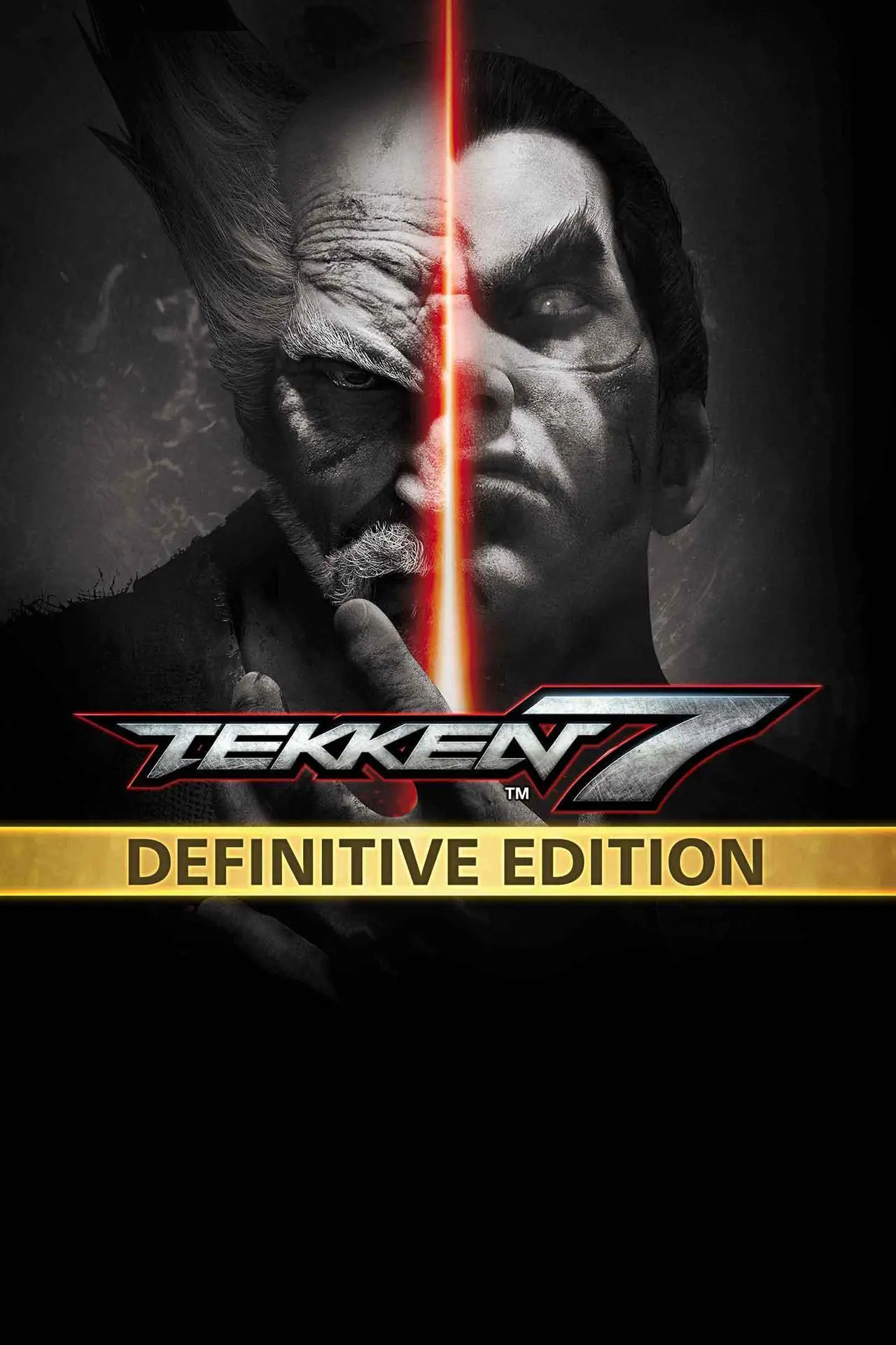
THE Tekken Edition to get and enjoy the ultimate fighting experience with ALL characters, stages and features included from all season passes!
Features
Includes:
- TEKKEN 7 Full Game
- Bonus Character: Eliza
- All Seasons Passes 1-4 & their bonuses below:
Season Pass 1:
- Mode: Ultimate TEKKEN BOWL & Additional Costumes
- 2 x Guest Characters: Geese Howard & Noctis Lucis Caelum
- Bonus (Customization Set)
Season Pass 2:
- 4 x Returning Characters: Anna Williams, Lei Wulong, Craig Marduk & Julia Chang
- Character: Armor King
- The Walking Dead’s Character: Negan
- Bonus (Customization Set)
Season Pass 3:
- 2 x Returning Characters: Zafina & Ganryu
- 2 x Original Characters: Leroy Smith & Fahkumram
- Frame Data Display (New Feature)
- Stage: Cave of Enlightenment
- Bonus (Customization Set)
Season Pass 4:
- Character: Kunimitsu
- Original Character: Lidia Sobieska
- 2 x Stages: Vermillion Gates & Island Paradise
- Bonus (Customization Set)
Note: TEKKEN 7 (full game), TEKKEN 7 Originals Edition, Season Passes 1-4, and DLC1-19 included in this edition are also sold separately. Please be careful not to buy the same content twice.
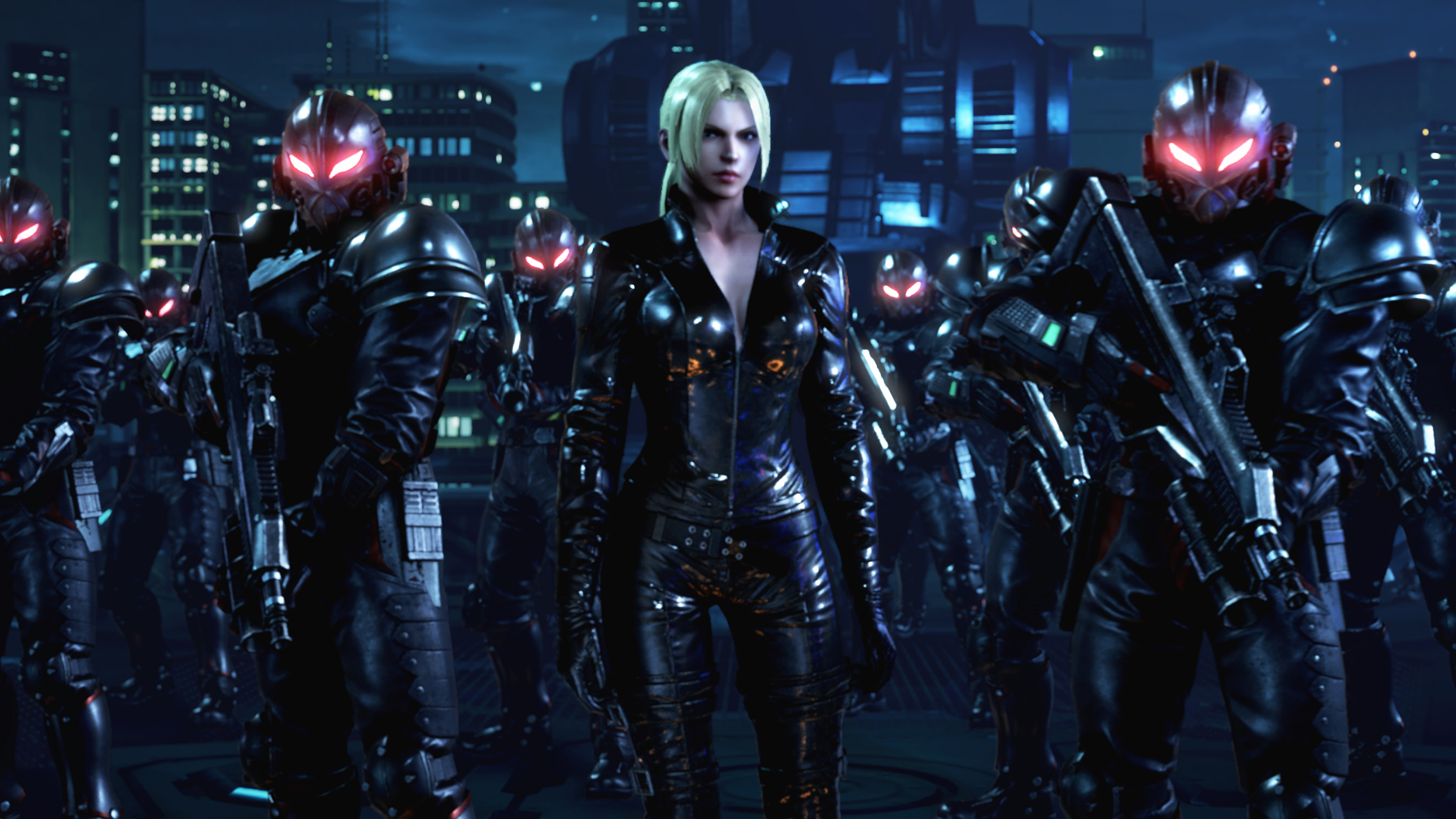
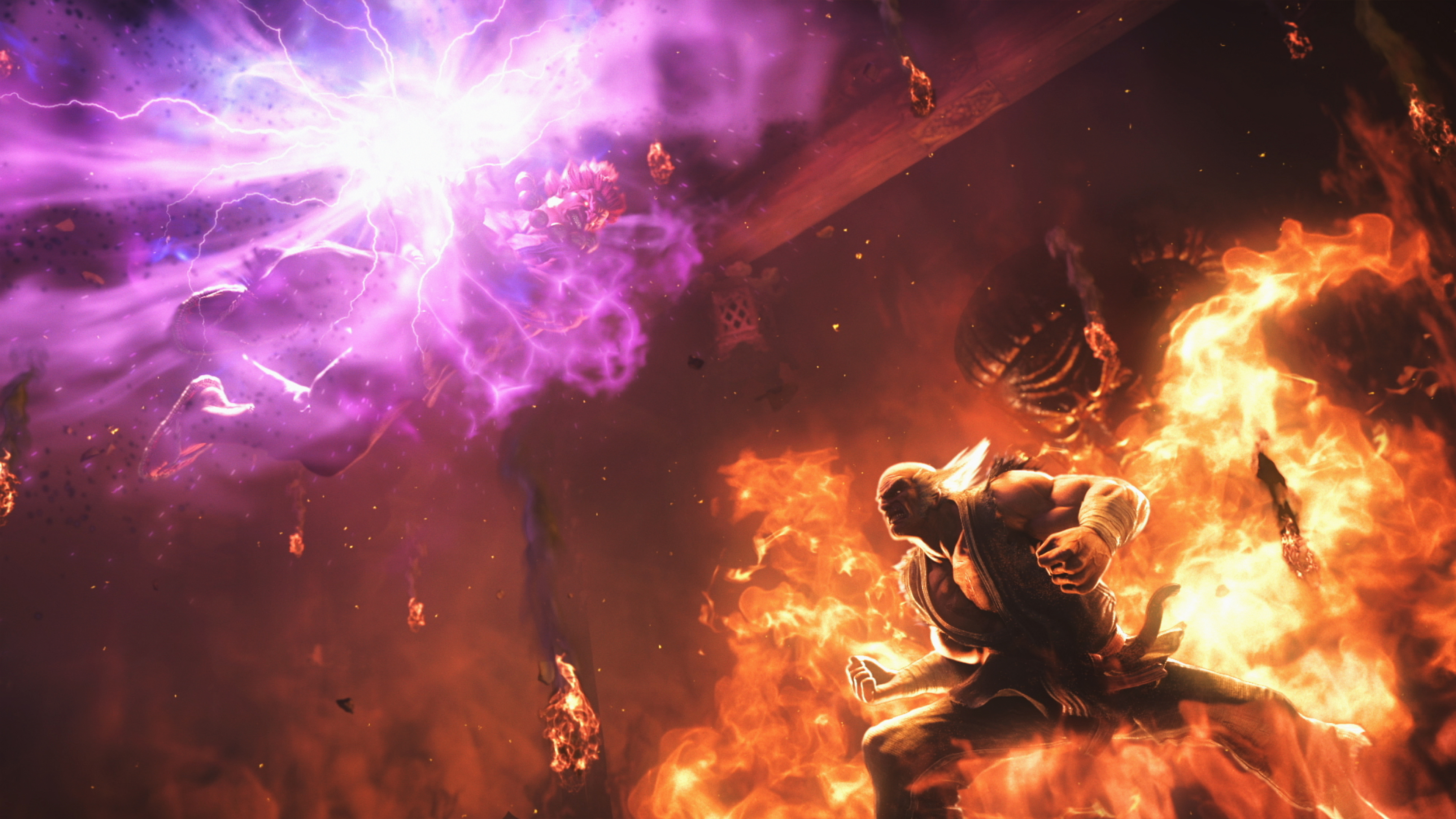
Screenshots


Gameplay Trailer
© SNK CORPORATION ALL RIGHTS RESERVED.
©CAPCOM U.S.A., INC. ALL RIGHTS RESERVED.
TEKKEN™7 & ©2017 BANDAI NAMCO Entertainment Inc.
The Walking Dead © 2019 AMC Film Holdings LLC. All Rights Reserved.
 Outlaws of Thunder Junction - Play Booster Pack
  Mario Kart 8 Deluxe - Nintendo Switch
  Logitech G923 TRUEFORCE Sim Racing Wheel for Xbox Series S|X, Xbox One & PC
  Intel Whitebook Gaming Notebook, 15.6" 144Hz FHD Display, Intel Core i7-9750H Upto 4.5GHz, 32GB RAM, 1TB NVMe SSD, NVIDIA GeForce GTX 1660 Ti, HDMI, Thunderbolt, Wi-Fi, Bluetooth, Windows 10 Pro
  Khadas VIN To VIN Cable Compatible with VIM1/1S/3/3L/4 Single Board Computer
  Logitech G923 TRUEFORCE Sim Racing Wheel for Xbox Series S|X, Xbox One & PC
  8BitDo Pro 2 Wired Controller for Switch, Windows, Steam Deck & Raspberry Pi - G Classic
  Adafruit Micro SD SPI or SDIO Card Breakout Board - 3V ONLY!
  ASRock Phantom PG27F15RS1A 27" FHD 1920 x 1080 240 Hz (144Hz and higher) Adaptive Sync Built-in Speakers Curved Gaming Monitor
 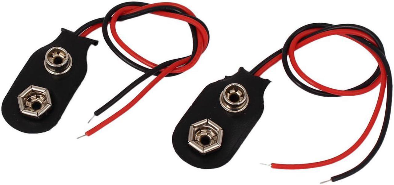 2pcs Faux Leather Wire Lead I Type 9V Battery Clip Connectors Cell Holder Buckle
 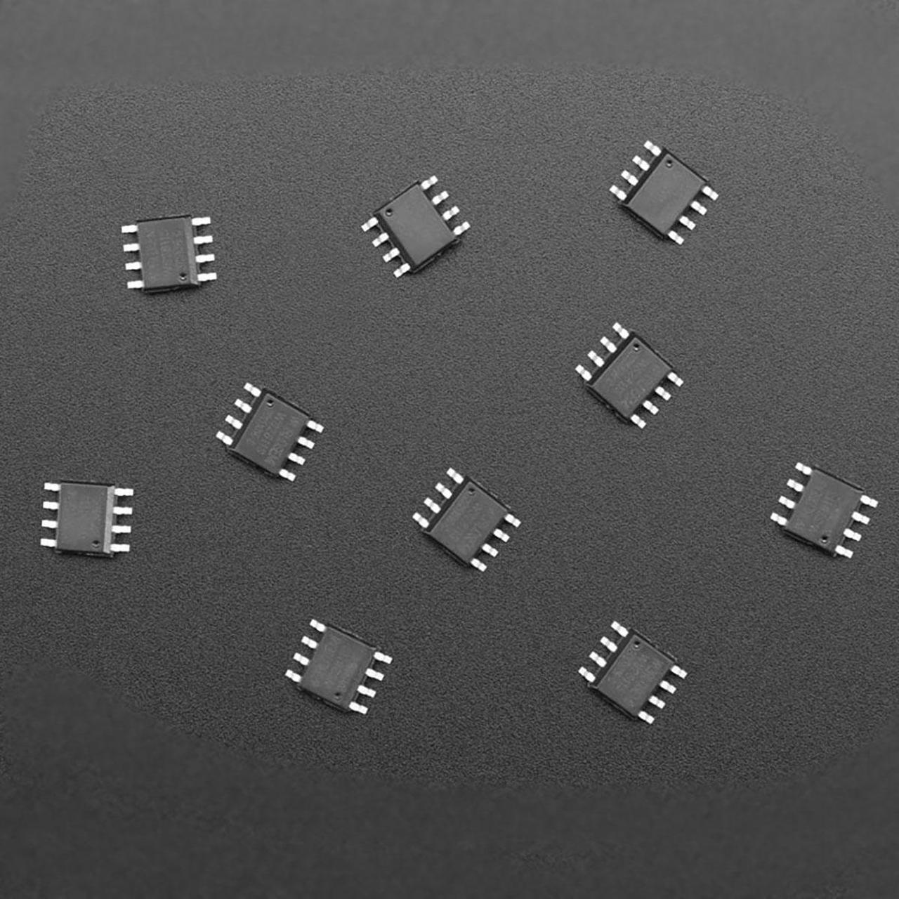 Adafruit WS2811 NeoPixel LED Driver Chip - 10 Pack
 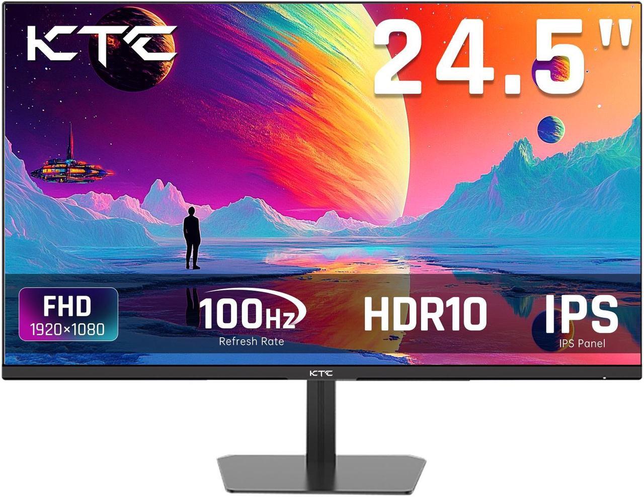 Hyperkin M07541-Tehg Hyper Gradient Eva Hard Shell Carrying
Reviews
There are no reviews yet.